Crohn's & Colitis UK
Digital transformation

How can the Internet improve life for half a million people? This was our challenge from charity Crohn’s & Colitis UK, who wanted to create an online hub providing life-changing information and support to the 500,000 people living with these conditions in the UK.
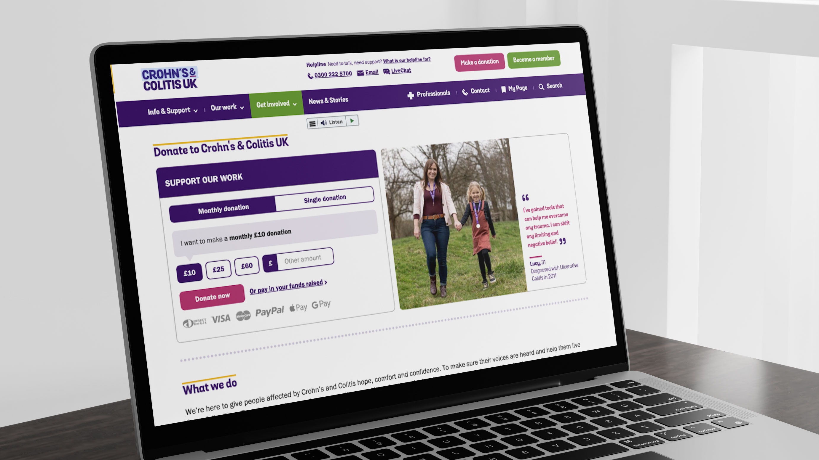
We’re only in year one – but we’ve already completely transformed their online presence. Exciting new features include streamlined user journeys, desktop and mobile optimisation and greater personalisation for individual users.
Users have been at the heart of the process every step of the way, from talking to stakeholders at the very start, to checking in with users as the hub developed. And really importantly, we’ve made it easier than ever to contribute financially, via our online donation platform goDonate.
The results? Bounce rates are down, time spent on the website is up and there’s been some really positive user feedback too. Why not have a look and see what you think?
